10 Reasons Why 2016 Was A Great Year For Architecture
2016 feels like a lifetime ago.
You might remember it better as the year it was confirmed we lived in an alternate reality.
A world where reality TV stars can become president and the loving liberal world we thought we lived in was just lie we told ourselves to make ourselves feel good about living through an extinction.
But amongst this dark political cloud, an architectural silver lining revealed itself.
Wired brought us the "25 Masterpieces That Prove 2016 Was an Incredible Year for Architecture".
We’ve narrowed it down to 10 to remind you that 2016 wasn’t all bad.
If anything, it was groundbreaking…
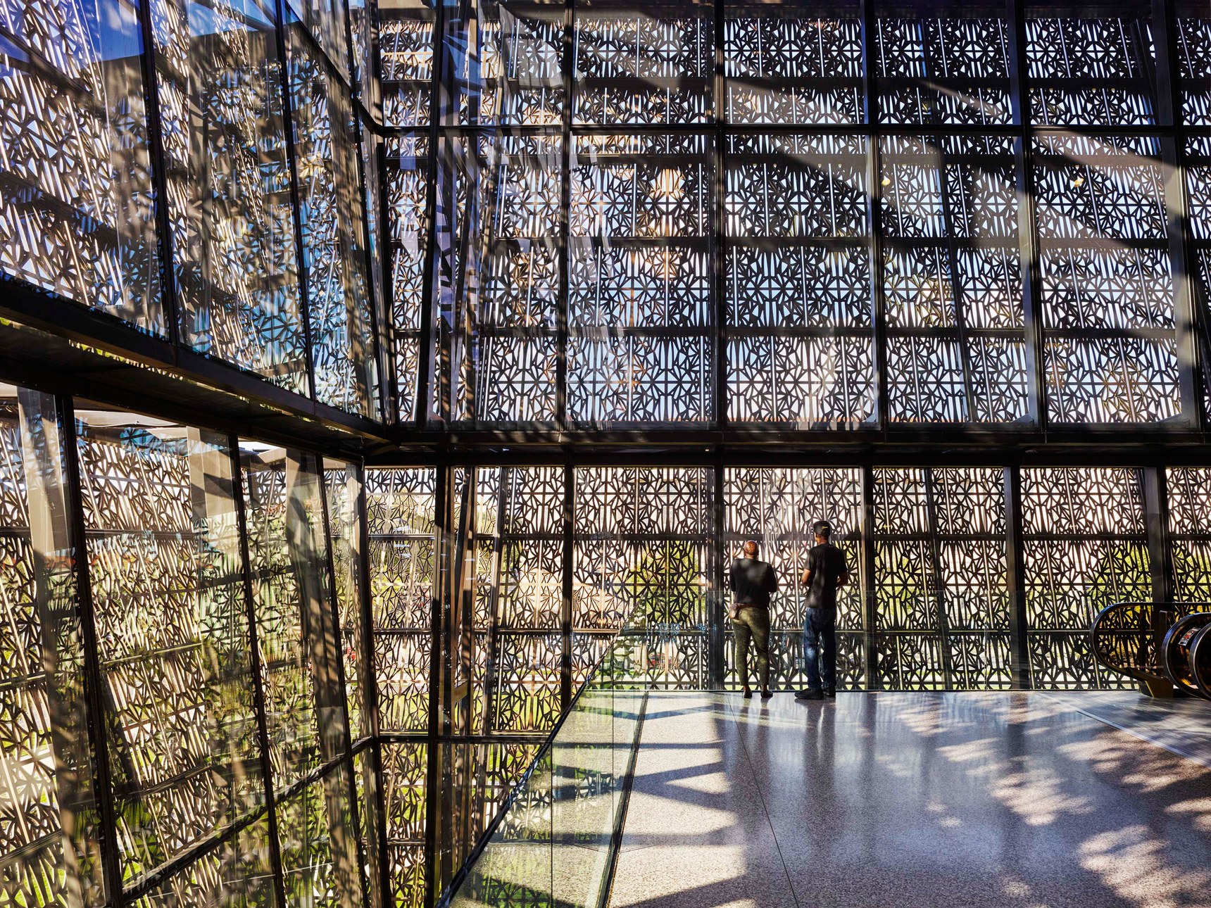
Freelon Adjaye Bond/Smith Group, National Museum of African American History and Culture, Washington DC
This museum will be the last one built on the National Mall and its design helps to translate the cruelty and injustice that was acted upon the African American population in the past.
David Adjaye places the starting point of a visitors journey underground and proceeds to draw them through to various levels while telling a story. He calls this Narrative Construction.
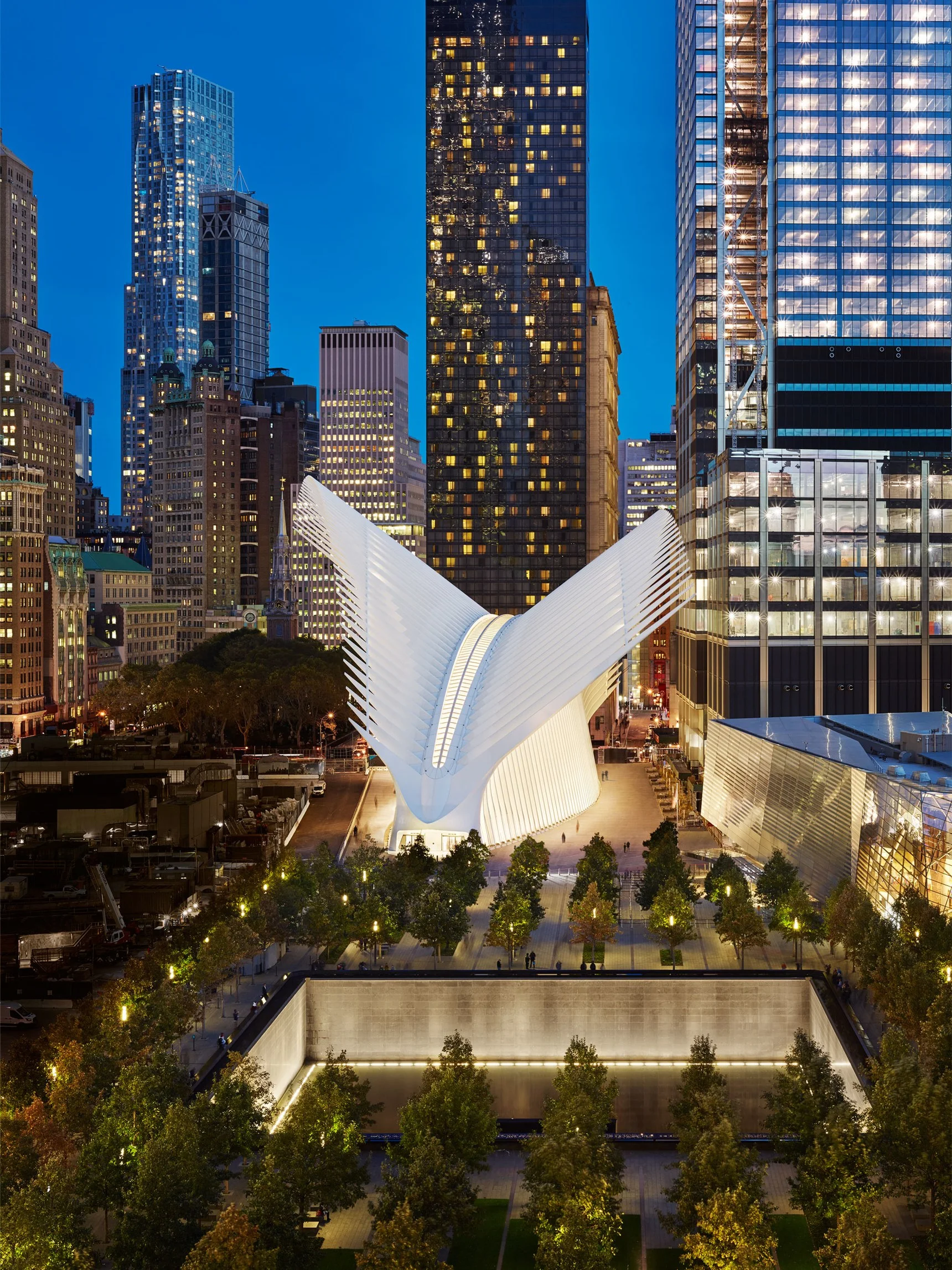
Santiago Calatrava, World Trade Center Oculus, New York
When a building has a price tag of $4 billion, you expect it to be rather amazing.
Designed to allow views outwards and upwards to the neighbouring skyscrapers, this fish bone / skeletal structure makes a sharp statement on the ground.
Functioning as a transportation hub and also a mall, Calatrava has broken the rigidity of it's block brothers and also brought an element of purity to the stained site of lower Manhattan.
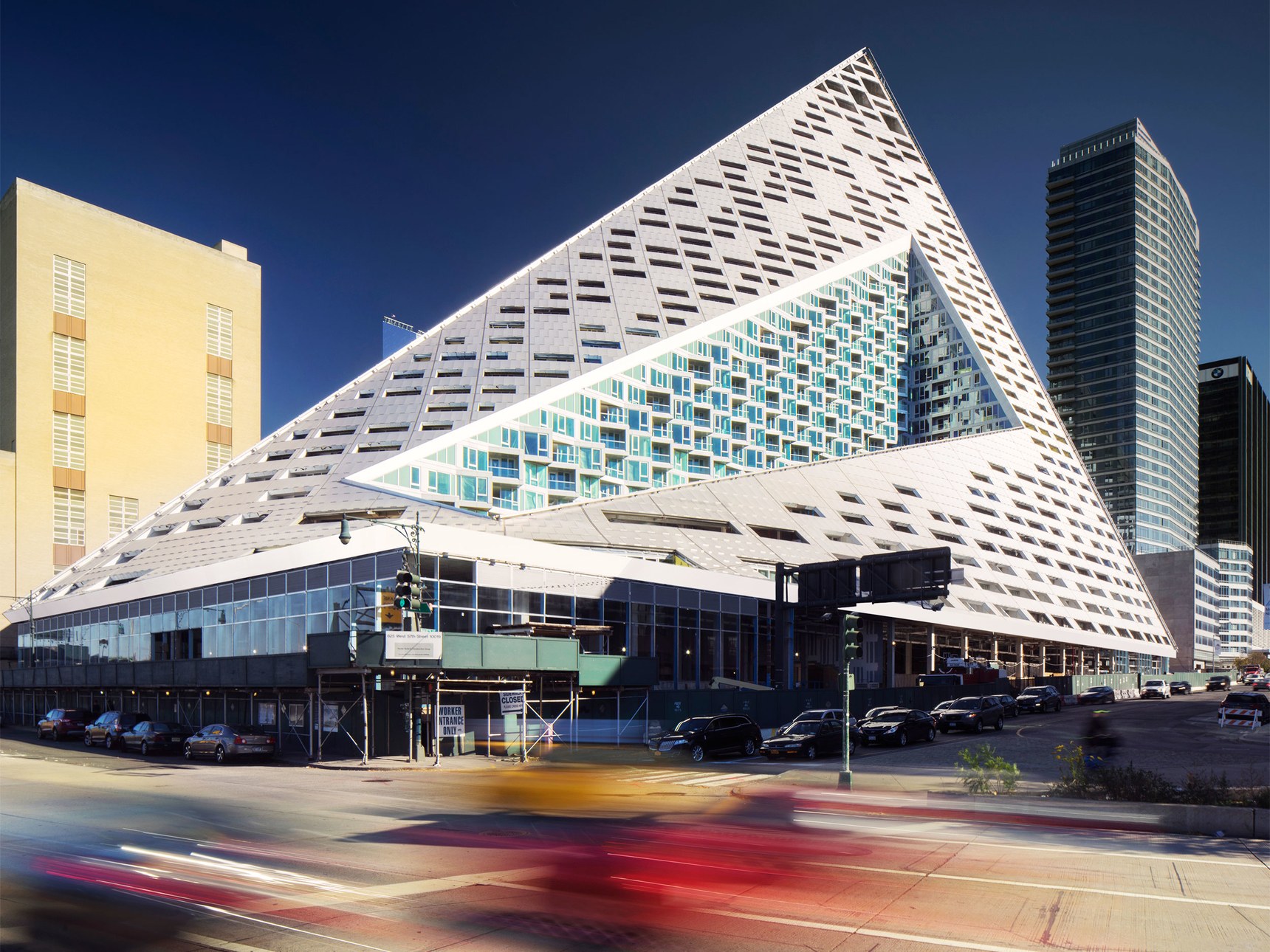
BIG, Via West 57th Street, New York
No, this isn't an Egyptian invasion. This is BIG's latest addition to the Manhattan cityscape. It's shape allows light to penetrate the street below and also provide an unobtrusive view of the surroundings.
Pyramids are not your typical skyscraper in New York but this new addition elegantly points up to the sky and roots itself boldly to the street below.
The apartment owners receive a generous amount of light via the courtyard carved out the centre of structure.
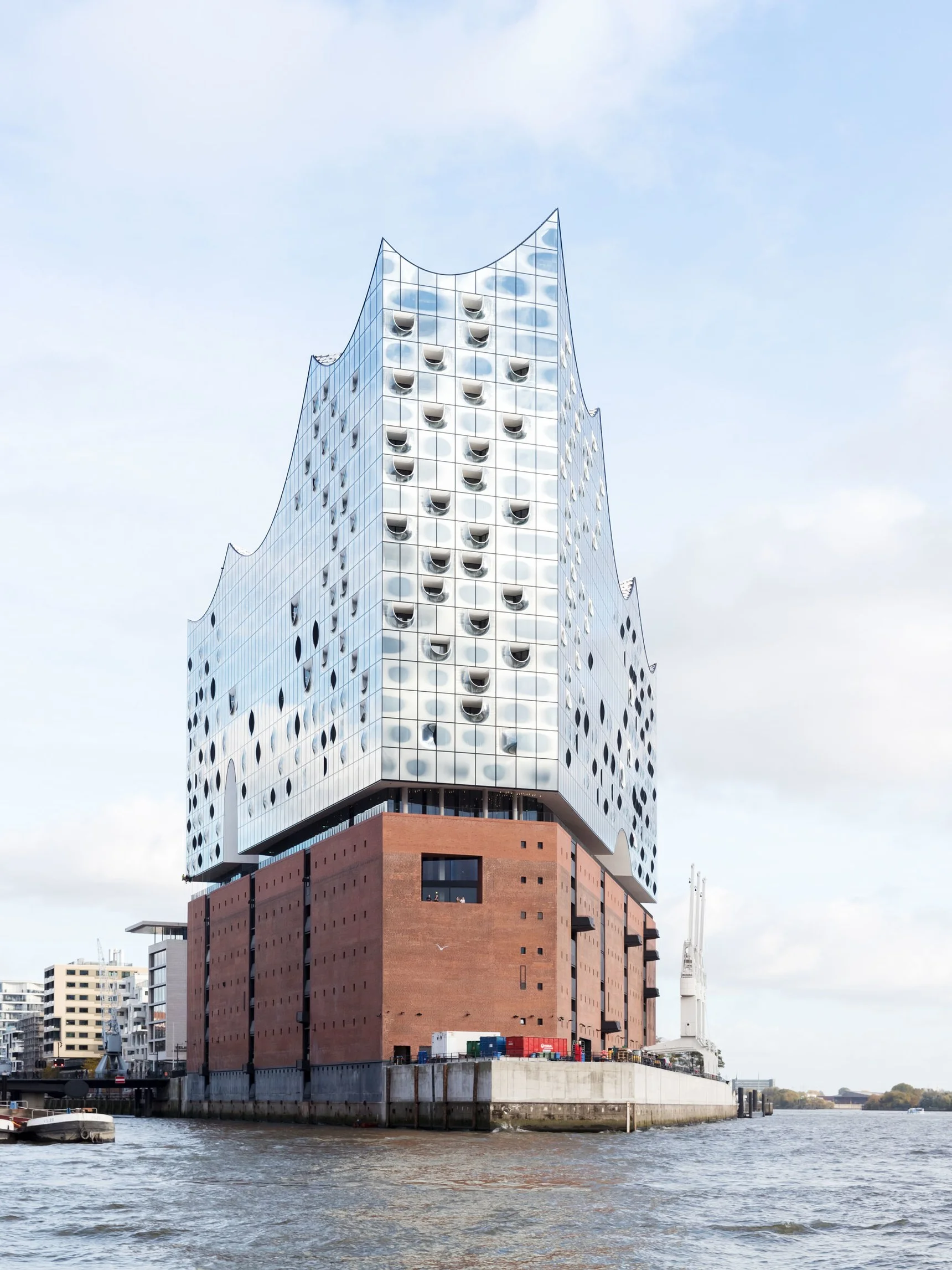
Herzog & DeMeuron, Hamburg Elbphilharmonie, Hamburg
As far as mixed use buildings go, Herzog & Demeuron's 10 year project does set the bar very high.
This concert hall along the Elbe river has a striking duo-chrome character, shiny and sharp on top and earthy and blocky below.
The contents range from concert halls, restaurants, terraces, apartments and a hotel.
Its jarring shape and perforated, mirror-like surfaces reminds us of nautical creatures or even a boat heading out to sea.
Interesting to see a building representing water, land and sky all in a single context.
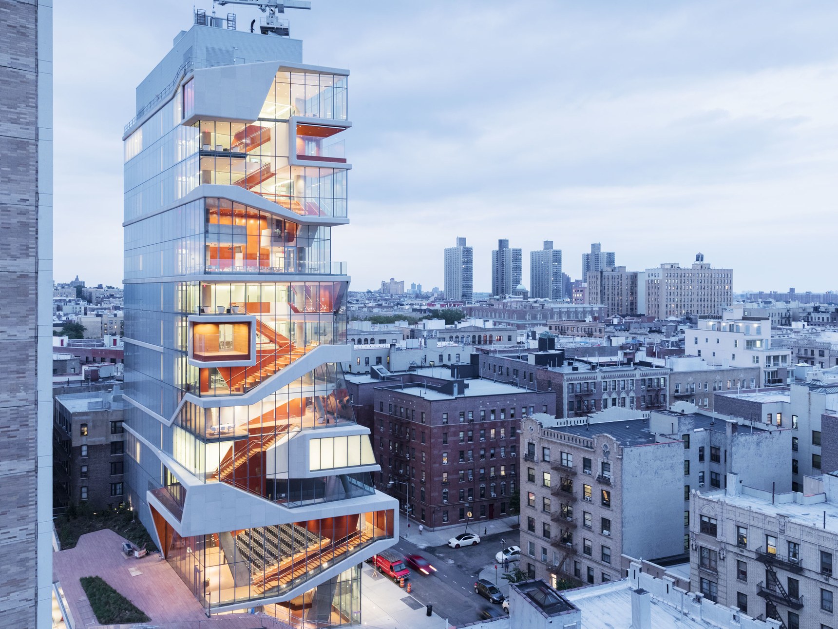
Diller Scofidio and Renfro, Roy and Diana Vagelos Education Center, New York
From the architects who designed the High Line in New York and the imaginative Slow House, comes this education centre that once again redefines traditional levelling of floors.
It contracts the buildings around it by being open and transparent. It is a building ready to accommodate for advancements in medical learning and education.
The interiors are spacious and clean (but not too clinical) and offer plenty of light into all corners of the tower.
Snohetta, SFMOMA, San Francisco
3 years after starting their renovations, San Fransisco Museum Of Modern Art has re opened.
With a facade that mimics the water surface of the SF Bay area, the largest living wall (green wall) in the US and innovative lighting and HVAC solutions, Snohetta has received more than just a nod of approval from architect world wide.
Its sculptural presence will surely encourage more of the same designs in the area - and if it doesn't, then this gem will sure shine even brighter amongst the concrete jungle that surrounds it.
SOM, US Air Force Academy Center For Character and Leadership Development, Colorado Springs
For architects, there is a constant battle between built up space and maximum supply of natural light.
SOM has managed to construct a spire of triangular glass panels that floods a forum space at the CCLD.
This glass spire juts out of the earth like a diamond tail from an aircraft and compliment the previously built Cadet Chapel near by.
SOM have created the perfect structure to inspire character and leadership development by reminding their cadets to look up and keep their heads high - aim for the clouds.
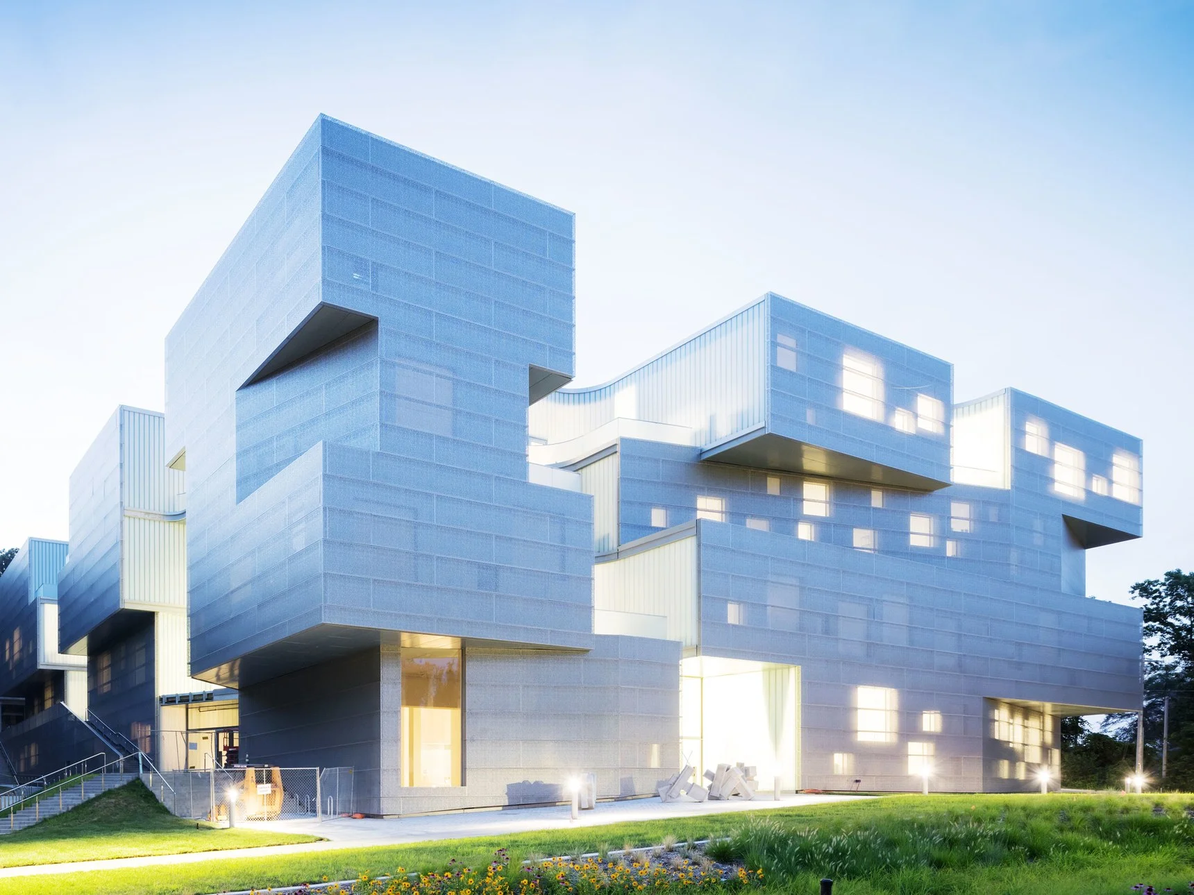
Steven Holl, BNIM, University of Iowa Visual Arts Building
Those who are well versed with Steven Holl's work will instantly recognise his signature design style - the semi-transparent facade, the stacked blocks and the assorted windows that reveal themselves once night rolls in.
Holl shaped the building to create multiple centres for light since he knew the total mass of the building would be fairly large and light would be an important factor.
Another concept Holl introduced was the intersections between horizontal and vertical planes.
This was to translate the actual connections going on within the building, which were between the various disciplines.
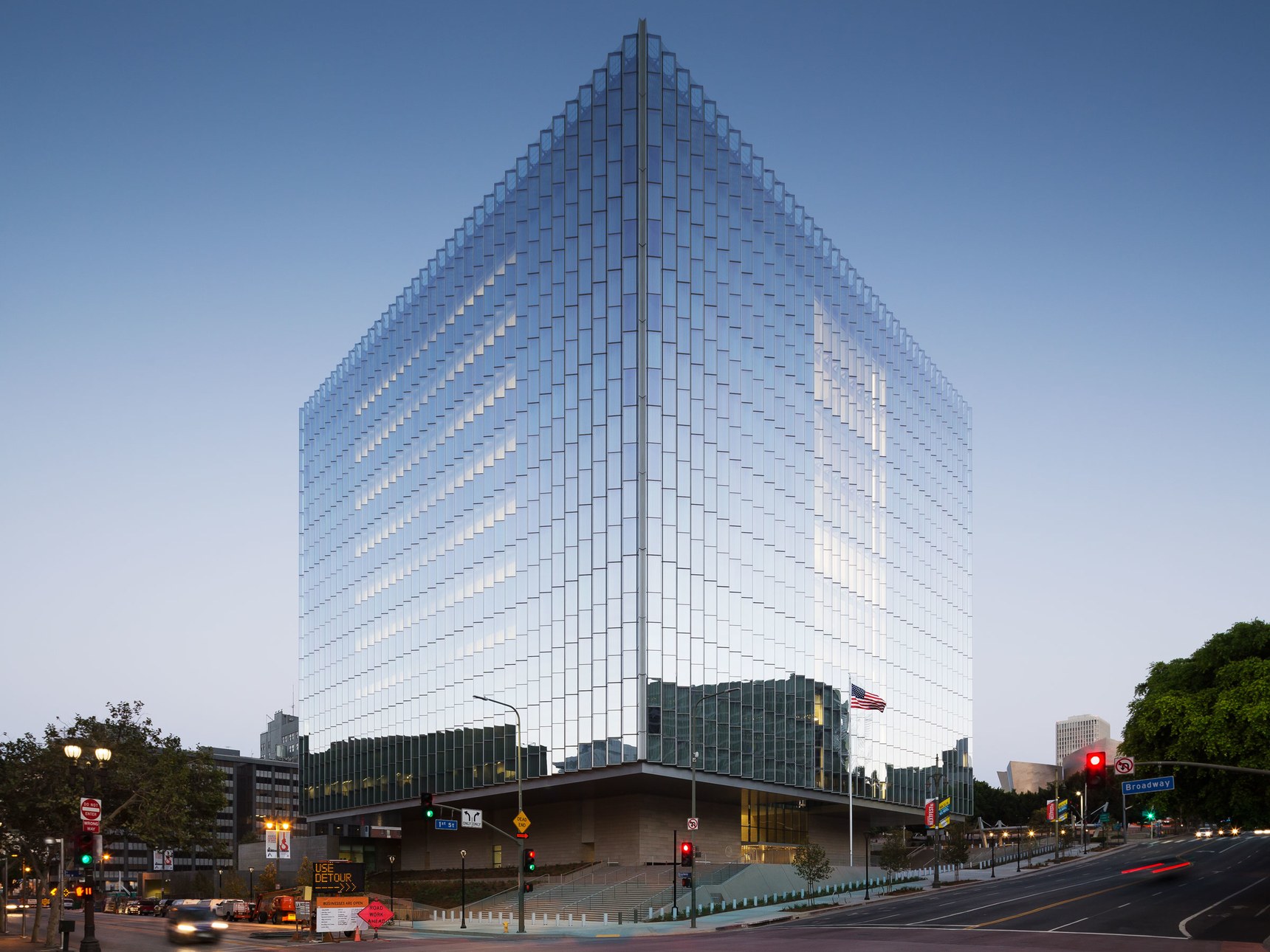
SOM, United States Courthouse, Los Angeles
Don't let this cube looking structure fool you, it is full of warm surprises within.
LA's new Courthouses designed by SOM seems to camouflage itself by reflecting the sky and city scape around it - maybe to say its decisions are a reflection of the community?
The folded glass helps with the camouflage and brings this flat material to a refreshing new dimension.
The proportions of the interiors are generous and receive plenty of light but does not come across as too clinical.
Some areas however do feel a little less thought out and seem a little boring. But, lets face it, as Courthouses go, this is already beautiful and serves its function.
WOHA, Oasia Hotel, Singapore
From WOHA we get a building that actually makes you say "Woah!".
Oasia Hotel is actually a mix-use building that serves as a hotel, offices and apartments.
If you look closely, you'll notice that there seems to be some kind of multicoloured scaffolding going on and plants poking out precariously.
Singapore has over the years been ramping up it's architectural prowess by inviting big names to design some serious icons.
WOHA knows the tropical region of Southeast Asia very well, having designed many beautiful structures across the region.
But, this is certainly a new style that emerged from the WOHA team.
While it's shape is fairly basic, the cut out half way up the building feels like a cavern or cave for safe refuge and seems to liven up the aesthetics.
The addition of a perforated cage that allows plants to grow and birds to nest isn't new but give this tower a few years and it's hanging gardens will surely be more impressive.
We salute anyone who becomes a gardener at Oasia Hotel.

